My Modern House: How David Liddiment and Michael Denardo transformed their mid-1970s modernist house by Michael Manser in Wiltshire
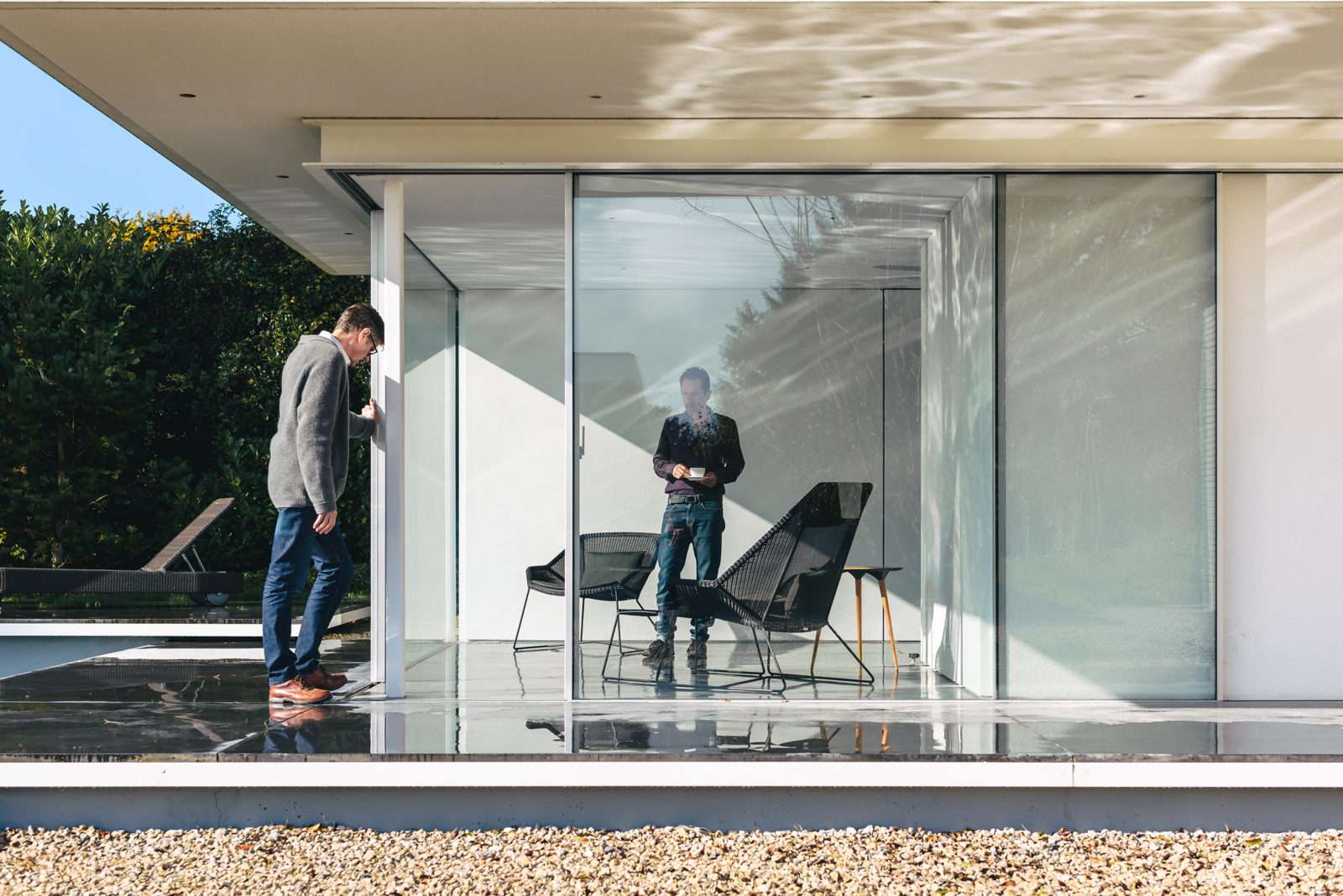
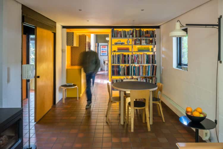
By the early 1970s the British architect Michael Manser had firmly established himself as one of the country’s leading architects. His work was much admired for the clarity of its conception, the high standard of its execution and was widely published. In fact, it was a newspaper article that led the original owners of this mid-1970s modernist house to call Manser, to ask him to create a house for a site they had just purchased overlooking the Wiltshire countryside. Manser agreed and came up with his design that fused – in typical fashion – his love of Miesian minimalism with strict geometric principles into a simple, low-maintenance steel frame structure.
Fast forward more than 30 years to 2007 and the house, it would be fair to say, needed reimagining. It was decorated, inside and out, in a suspicious shade of brown, for one thing, and the straightforward, simple elegance of its original intent had been somewhat diluted by the planting of a few too many rose bushes over the decades.
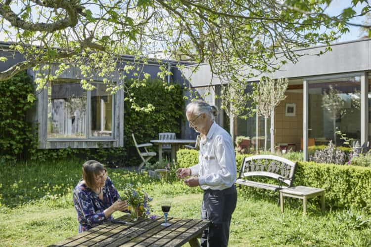
Today, the same house is transformed. Under the ownership of David Liddiment and Michael Denardo, who bought the house via our agency, and the work of Guard Tillman Pollock Architects, Mancett House, as it’s known, is more refined and purer in its architecture than ever, while the creation of a separate studio has “completed” the site, says David. Here, we speak to the friends about the renovation, their love of art and the value of some peace and quiet.
David: “I grew up in Huddersfield and I can remember looking up at Farnley Hey, the house by Peter Womersley, and just being dazzled. To a kid growing up in an industrial town, that had a huge impact on my aesthetic. But it wasn’t just about modernism, that house represented modernity, a way of looking at the world, that appealed to me more than anything.
“As I grew up and was able to afford to express that interest, I’ve had the chance to work on our London home, which expresses very strong modernist lines within a period home in Chiswick. Then came the opportunity to buy somewhere outside London. I suppose we wanted somewhere that was accessible, that gave us a different quality of life, a different atmosphere.
“A thatched cottage didn’t appeal to me at all. Part of the joy of the countryside is the light, the skies and the views, which are all the more appreciated in a house like this.
“The Modern House was only a few years old when we bought this place. Our search actually started at Long Wall in Suffolk, designed by Philip Dowson. We saw it on the website and when we got to the viewing day there were around 30 cars there. It was 2007 and the market was booming.”
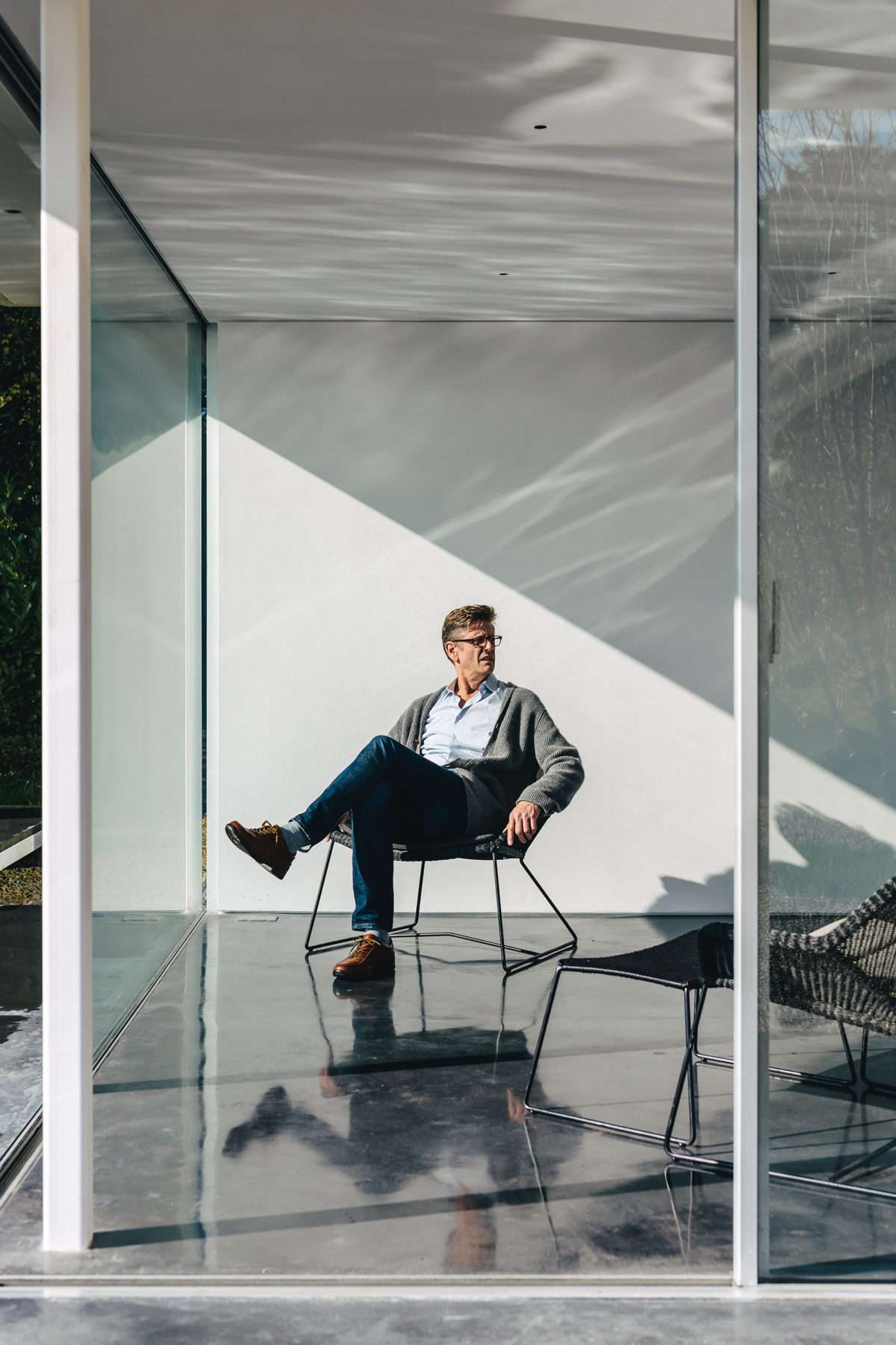
Michael: “We put an offer in and came close to buying it twice, but the sale didn’t go through in the end. Now we realise how lucky we were to miss out on it because we hadn’t thought it through enough. It would have taken around three hours to get there from west London and, actually, it didn’t have the space we needed.
“When David showed me pictures of this place, I didn’t want to see it. Because of the furniture, the ceiling, the 1970s colours – I just thought it was horrible!”
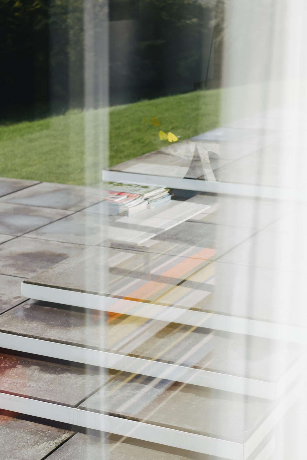
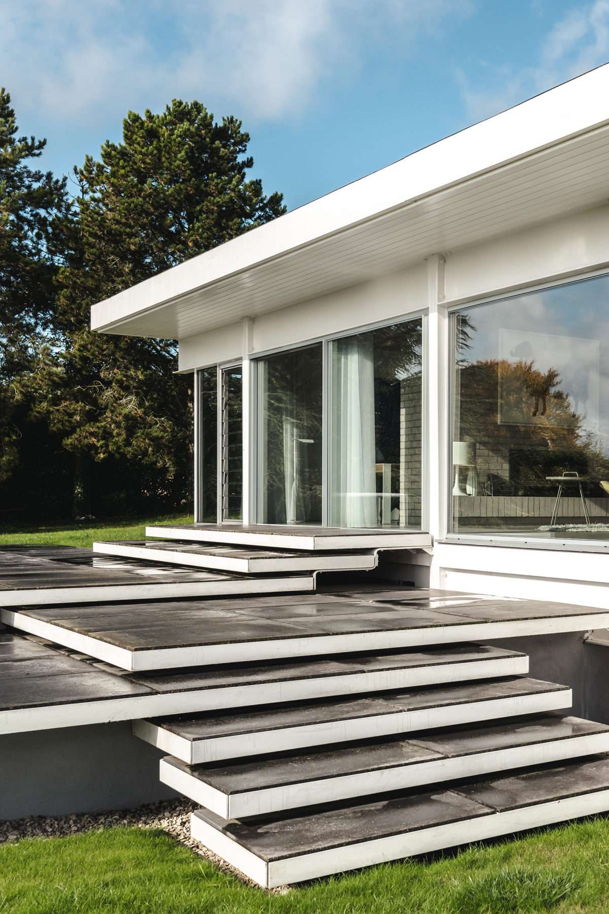
David: “I could see the house was interesting underneath all that. But the brown gloss paint was bad, as was the orange-stained wood ceiling, and they had bricked up the undercroft, so the house didn’t ‘float’ anymore. I got in touch with the architect Mark Guard, who worked on our London house, to ask if he would come and see it. He came down, had a look and then we bought it.
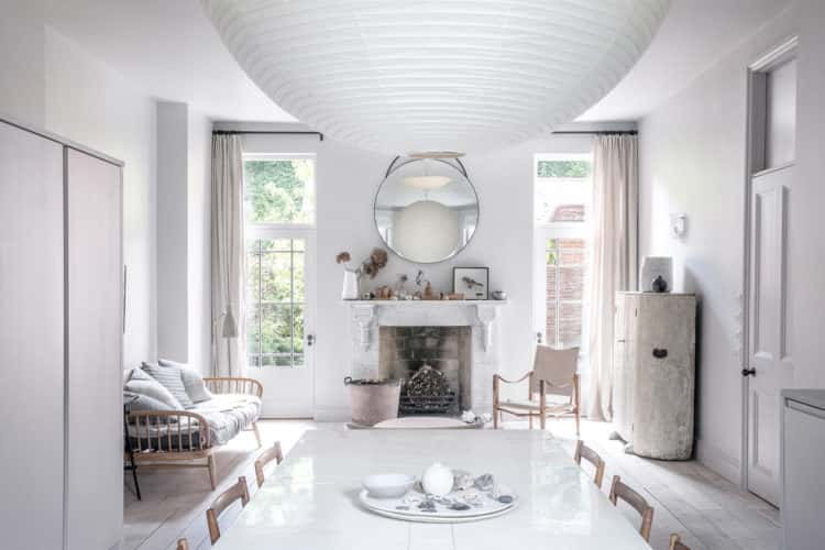
“After the sale we got in touch with Michael Manser, and invited him to see the house 30 years on. I think he was quite chuffed when he came. He wasn’t that keen on the bricked-up float, or the two doors they had put in to break up the big open living space. We had ripped out all the wood panelling and fitted wardrobes by then and painted it white and put some furniture in, so it was looking good, actually, but it wasn’t like it is now.
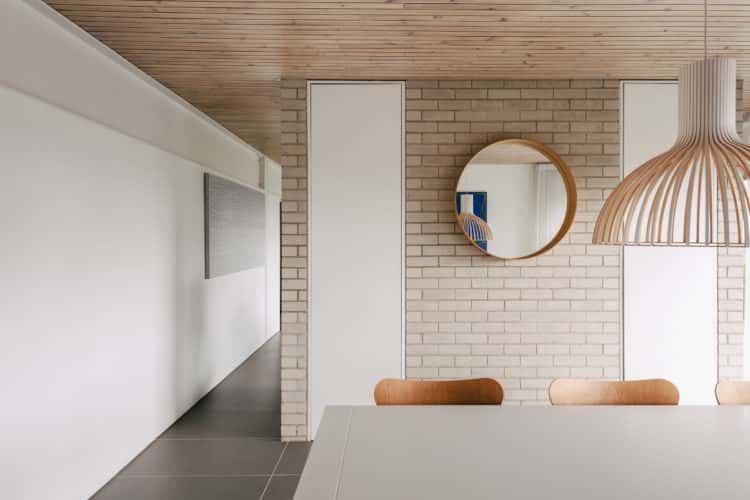
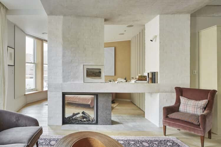
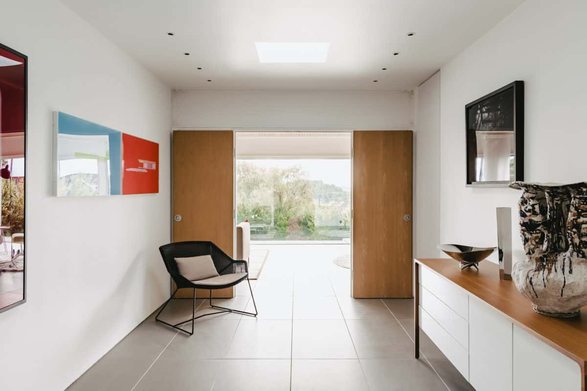
“When it came to the work, we looked at the house and knew we wanted it to float again and to have an alternative entrance to the rather unprepossessing one that was here before. We obviously wanted to open up the living area to make it one big space again, and the kitchen needed modernising.”
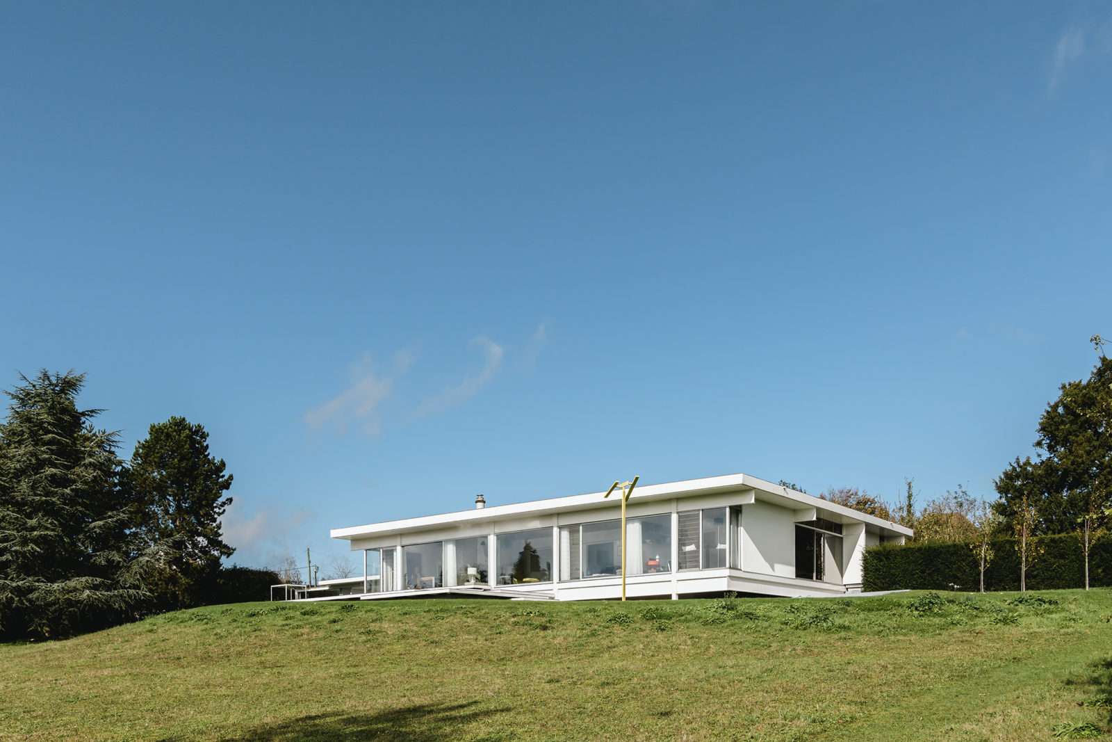
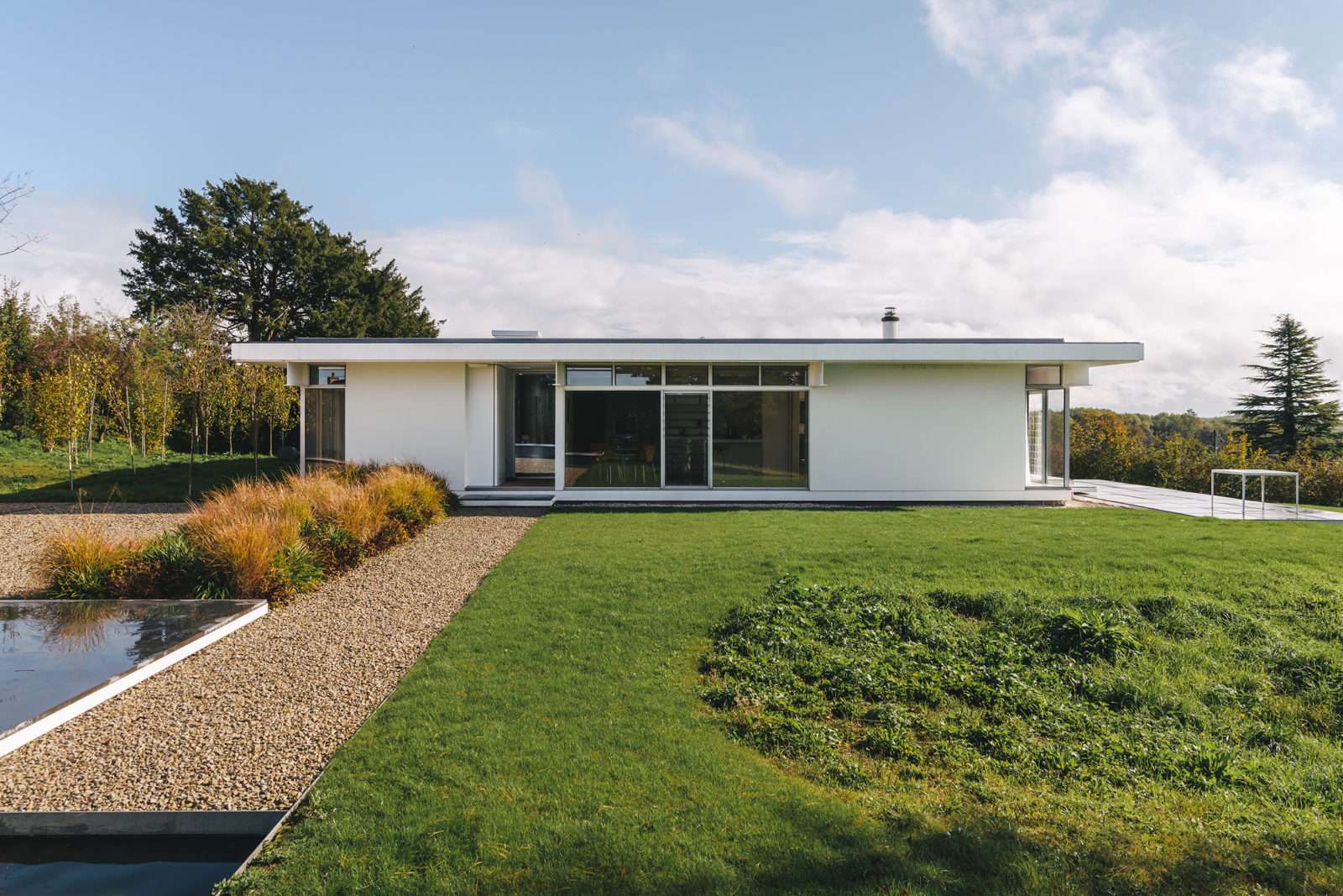
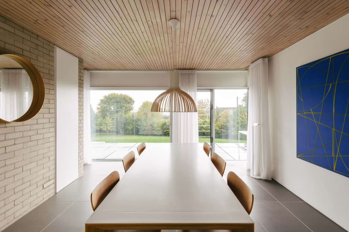
Michael: “We wanted to keep the basic framework of the house, and not change it too much. I think one of the biggest things was bringing the land up to the house, which made it sit differently and look not so squat.”
David: “It was about honouring what it is: the beams, the glazed front, the modernist elevations. I think we’ve honoured the original intent, but the solutions Mark came up with worked around that.
“For example, we moved the entrance of the site down the hill. The original front door was ridiculous: it was panelled, and out of keeping with the overall aesthetic, and it opened onto this huge hall that was just too big.
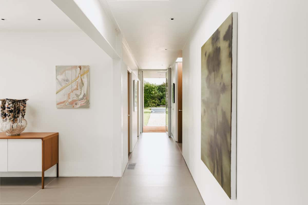
“The solution was to move the approach to the house, which does two things. One, if you’re driving or walking to the house you get an amazing view down the hill as you turn in, and it contextualises the house quite nicely. Secondly, we defined the way into the house, which is quite un-grand – just steps up to the door – creating some kind of journey and mystery, because you don’t get the full extent of the house until you walk through the hall, down the corridor and into the living room, and that was Mark’s idea. There’s a bit of theatre to the access now. The house doesn’t just float, it sprawls out of one corner in a series of white steel framed terraces which knit the house into the landscape.
“When we finished the work, I was so pleased with the outcome and found it an infinitely better place to live in. There was just one thing, though, that didn’t sit right, and which looked completely out of place: the old garage that was a later addition to the house.”
Michael: “He’s a completist, basically.”
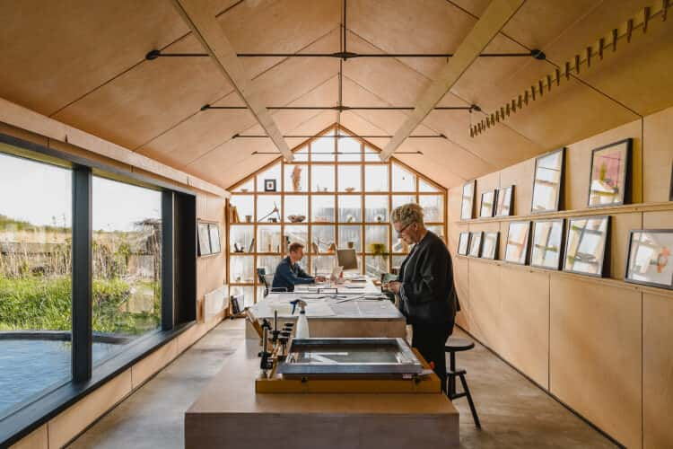
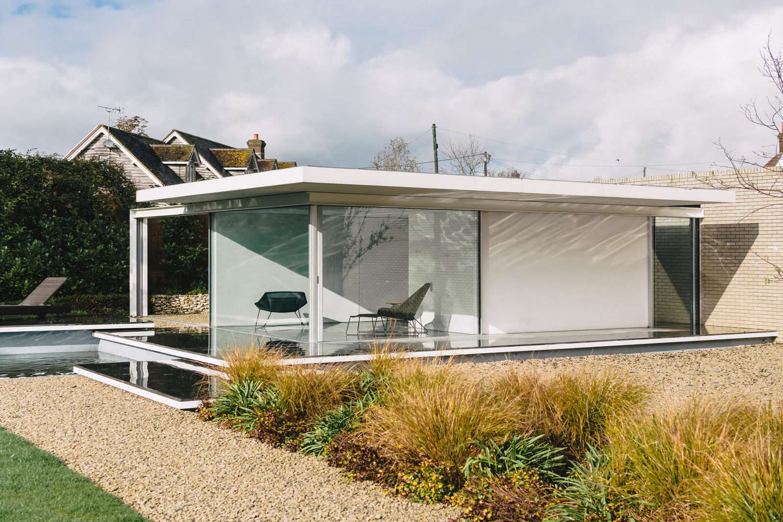
David: “It just undermined everything we did, or it did to me at least. Getting rid of the garage and creating a new space allowed us to deal with all of that. Michael is an artist and jewellery designer and he had a workshop in London, which he gave up because he was winding his business down to do something different. So, I said we could build a studio here for him, which would allow us to finish off the site.”
Michael: “It does complete the house. Once it was done, I noticed the dialogue between the two: you go to the studio and you’re sitting there looking at the house in a way you never used to. So, it’s like a Feng Shui thing; there’s more of a flow.”
David: “It also enhances this house, which, just from an aesthetic point of view, looks better with the studio; it’s balanced. It uses the same language as Manser’s original design with steel beams, an overhang but with different proportions. It knits everything together, creates the courtyard, and we built the big wall, which just sits there entirely on its own accord. And it meant we could create some formality in the landscape that gave it a reason to be – like it had a purpose.”
Michael: “I love the studio. Because of the cost and everything I didn’t want to feel responsible if I didn’t use it much but, as it turns out, I’m going to spend more time down here, and I have been using it a lot.”
Michael: “We’re both interested in art, but when we moved here, we didn’t know about the New Art Centre in Roche Court, which is two minutes’ away. We bought a piece from them in the first month we were here and then that opened a dialogue and we’ve become close friends with Madeline who runs it. She has made us feel part of the community.”
David: “I used to be crazy busy in London but less so now, as I’ve half retired. I work part-time for a television production company, Fremantle. Until last year I was chairman of The Hepworth Wakefield in Yorkshire in the brilliant Chipperfield building. It was through getting to know Madeline that that came about, as she asked me to go for it.
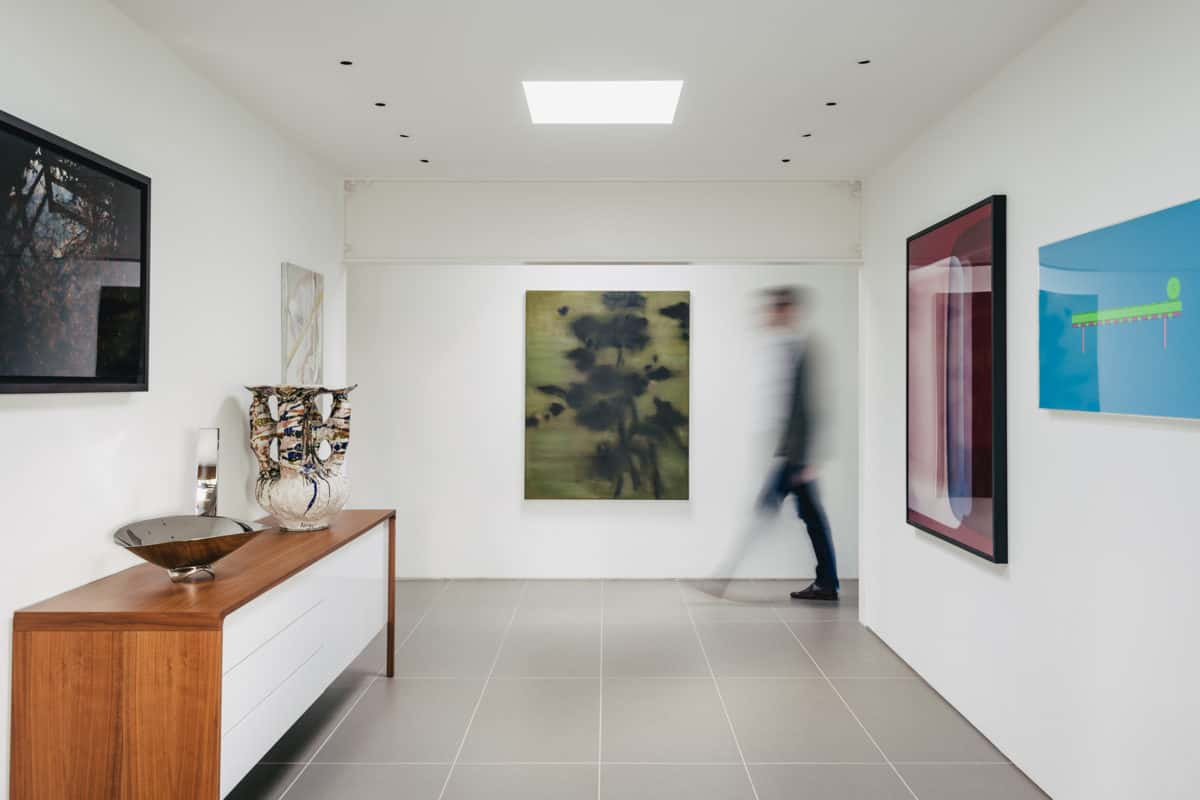
“Here, we have work by Michael Craig Martin, Christopher Le Brun, Rebecca Salter, who is amazing, and a few others. I don’t buy for investment, just what I like, but we have some nice pieces.
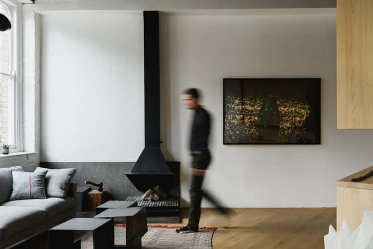
“Michael has a good eye. Years ago, he spotted a painting at the London Art Fair by a Swiss painter called Uwe Wittwer, and we’ve now got quite a few of his pieces. This one here is a stunning piece, and it’s never looked better than it does in this house, in the place that it is now, and that’s very enjoyable.
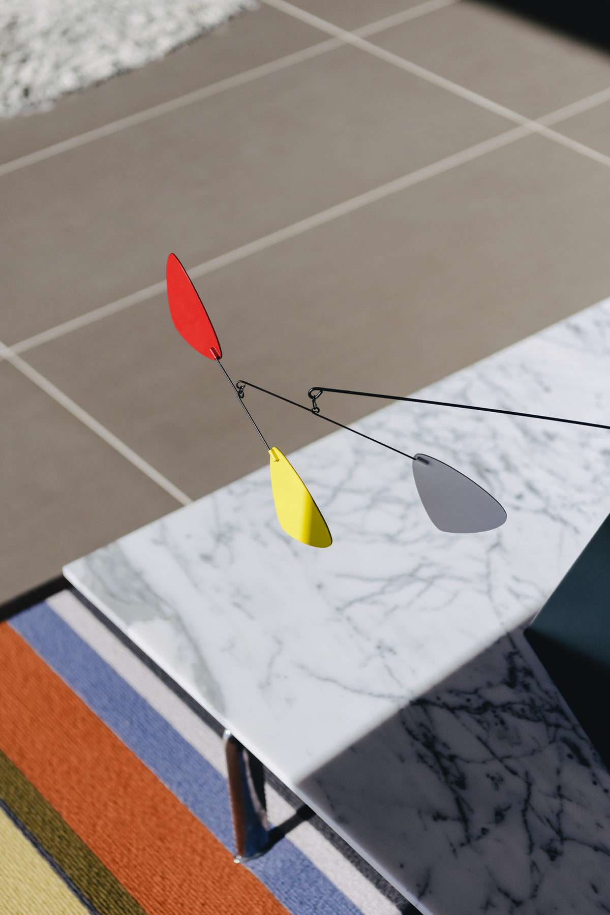
“The house needs splashes of very strong colour, but not too much, and that has to some extent informed some of the things we’ve got – Michael Craig Martin works very well here for that reason. He created a series of prints which celebrated architects like Mies van der Rohe and they came as two prints – a building and a piece of furniture – so we have Farnsworth House next to the Barcelona day bed and it works fantastically.”
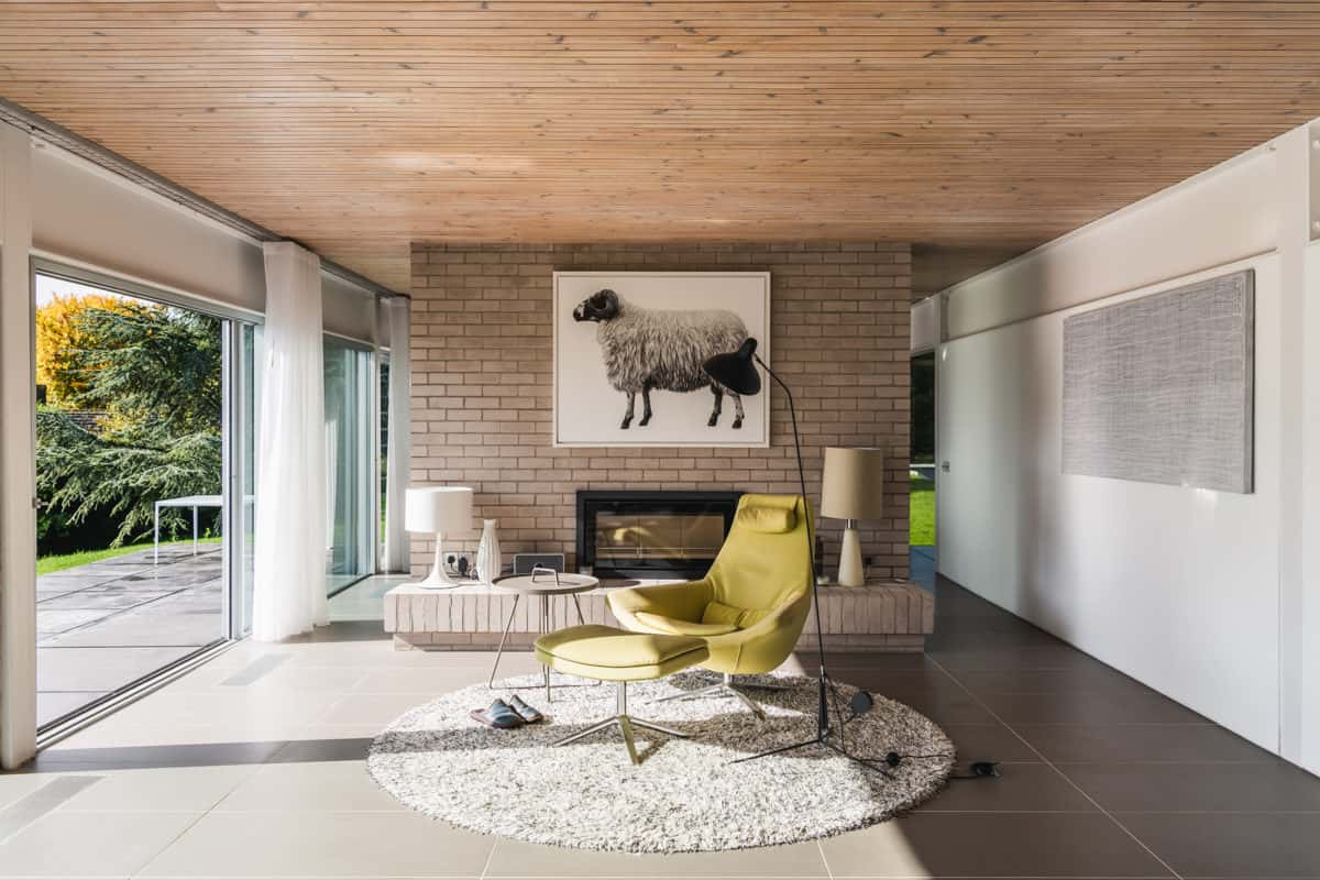
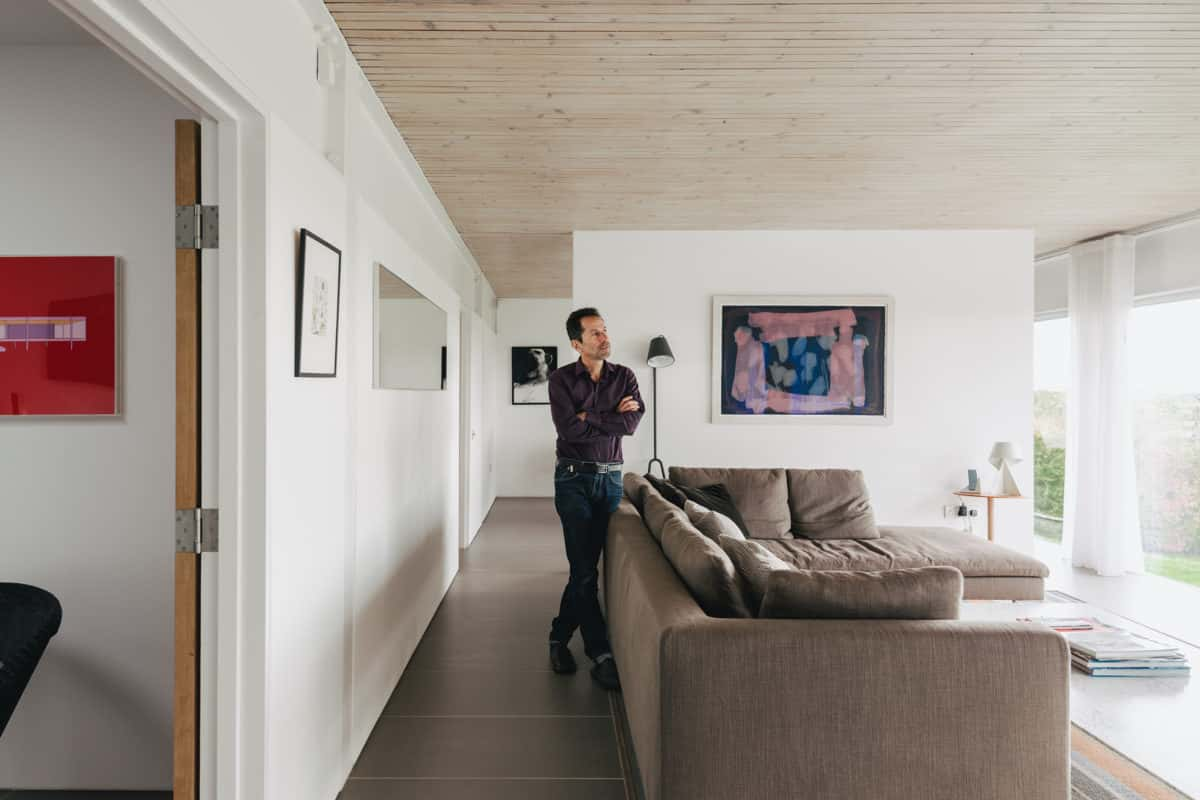
David: “When we’re here Michael walks a lot, me less so, but there are some nice walks around here. I just use it to chill and relax and, although it sounds incredibly pretentious, I take pleasure from the architecture and the design.
“Although the design and style are what I enjoy, for people who are not used to it, it can be quite dazzling, and I think it’s quite good to have that corrective because you appreciate it all the more. Some people, of course, can’t relate to it and can’t imagine how we live in this but then we go to their house and they have thousands of ornaments everywhere.
“You can’t take on something like this and expect it to be all sorted in a few years. The garden, for example, is completely transformed but it takes time to bed in and grow and the meadow is different every year. We won’t see the benefit to some of the planting we’ve done for four or five years, but that’s part of the pleasure, in a way, of seeing how it develops.”
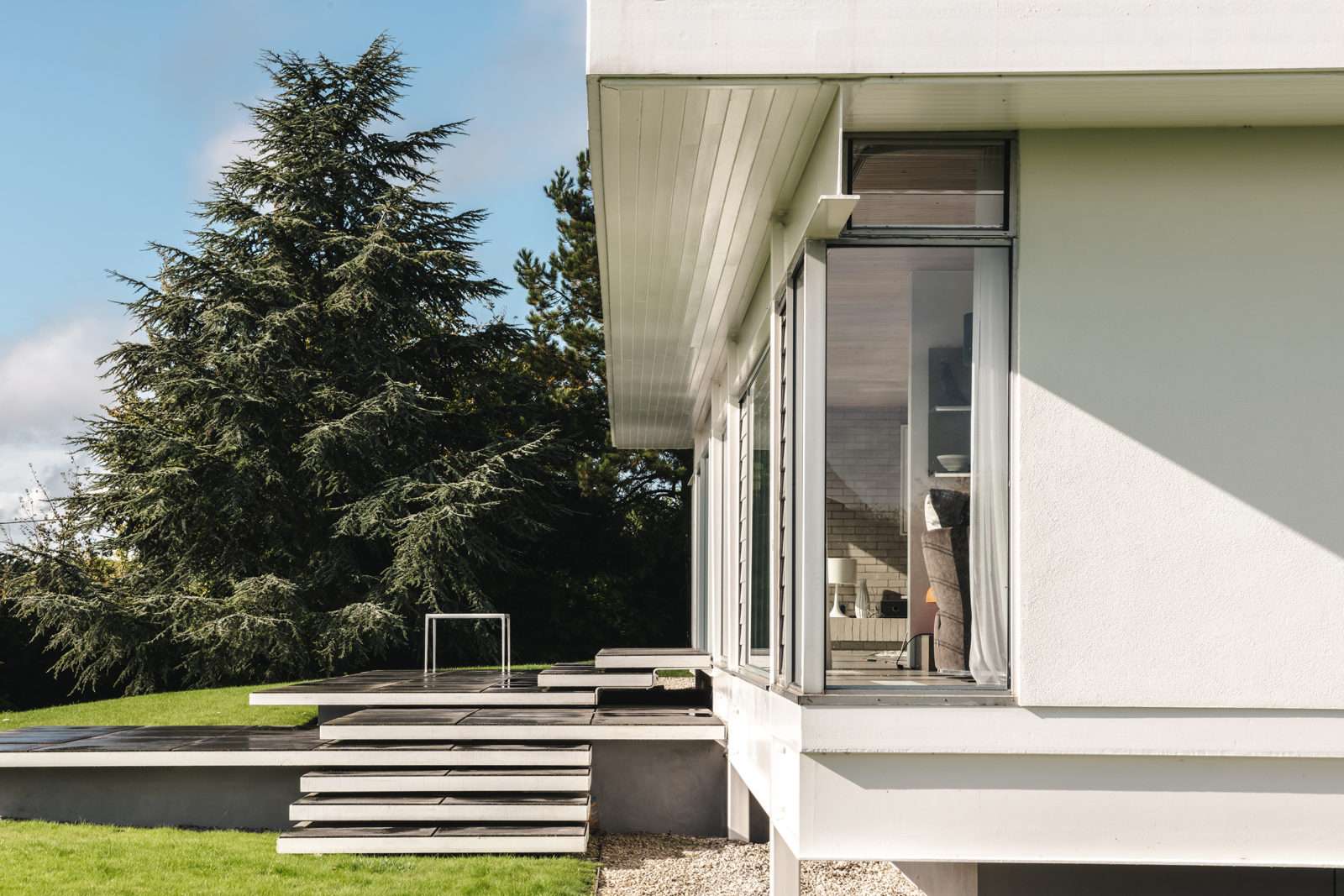
Michael: “It’s elevated now, and doubled the pleasure of being here, at least for me anyway. I love this house in a way I didn’t experience before. It’s the way you can move around it now, whereas before you just stayed in the house, more or less, and then you went for a walk. Now there’s this dynamic that’s richer.”
David: “That’s all down to the quality of the design and architecture, I think. Good design that isn’t about fancy detailing or being too clever. It’s about living well. It’s one of the great pleasures of life to live in a house like this.
“I didn’t know what it was that drew me to these houses, and it was partly about aesthetic, but it was also about modernity: I wanted to live in my time. To live in a well-designed, modern house is thrilling, and it does absolutely enhance the quality of your life, I can say that without a doubt.”
